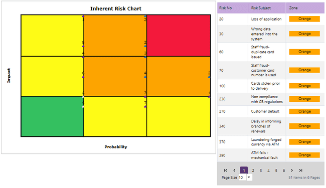
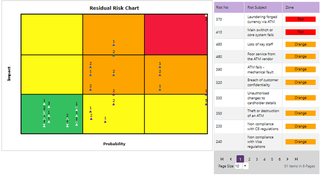
Finally, the Impact/Probability Chart gives a pictorial representation of what risks are currently giving the greatest cause for concern, using the familiar “top-right”, or “Heat Map” representation. The system is able to generate the chart for Inherent Risks (net of all control) and Residual Risk after considering the controls in place to mitigate the risks.
1. Impact/ Probability Chart (Inherent Risk):

The chart plots each risk, net of its controls, on a “Heat Map” where the closer to the top right corner you get, the more serious the risk is. So, in this example risks 40,50 and 290 are of considerable concern. The short description of each of the numbered risks is shown in the key on the right-hand side. If you have a lot of risks on your chart such that the risk numbers would overlap, the chart will appear with the Quantity of risks on each plot (1,2,4 etc.), to see each individual risk number, move the mouse over the plot.
2.Impact/ Probability Chart (Residual Risk):

The residual risk chart is similar to the inherent risk chart. However, it plots each risk on the “Heat Map” while taking into consideration the controls mitigating the risk. Accordingly, we can see that in this example and after considering the controls in place to mitigate the risks, risk number 40 was no longer a concern for the business unit as it is appearing in green now. Meaning, the controls in place fully mitigate risk number 40.