Clicking on the + besides this heading provides you with 5 options:
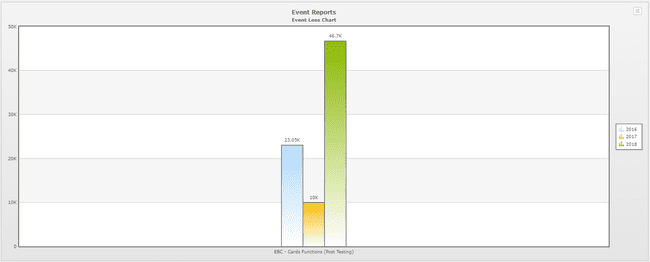
1.Event Loss Chart
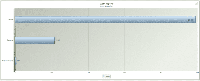
2.Event caused by
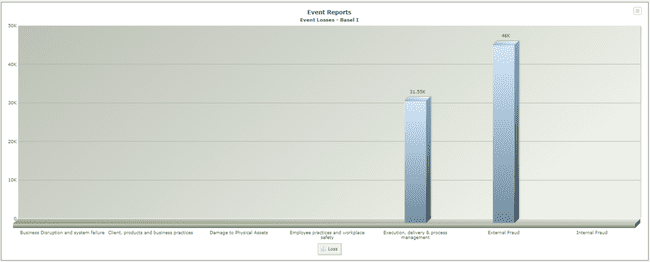
3.Event Losses - Basel Level I
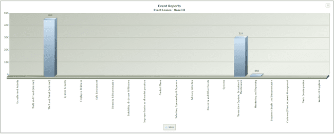
4.Event Losses - Basel Level II.
5.Events Exceeds Appetite
Event Loss Chart - This report allows you to compare losses over any 3-year period or show loss values and numbers for a specific year. You make your selection from the following menu:


Which is presented when you click on the chart heading.
Event caused by: this chart shows a split of all events by cause, i.e. external events, human error, systems etc.

Event Losses Basel Level I - click on this heading to bring up the selection menu:

Here you have a choice; you can either produce a chart of Accumulated Losses or Comparative Losses.
Accumulated Losses: this graph will show, by Basel Risk category, the accumulated losses for a specified period; use the dropdown menus to specify the period.

Comparative Losses: clicking on this provides you with another menu:

This selection lets you compare one year against the immediately preceding year as far as losses is concerned. So, comparing 2017 losses with 2018 produces the following report:

Event Losses Basel Level II - this chart is exactly the same as the Basel Level I chart except that it can be run for an individual Basel Risk category.

Events Exceeds Appetite: This chart highlights all events that exceed the business unit’s appetite level defined in the entity screen.